What is the production possibilities curve?
The production possibilities curve, or PPC, represents the combinations of outputs that an economy can produce at maximum capacity using given factors of production and production technology.
In many economics textbooks, the PPC is drawn as convex to the origin. This is usually explained through increasing opportunity cost: as an economy produces more of one good, it must give up increasingly larger amounts of the other good.
I wanted to understand this not only as a memorized diagram, but as a shape that can be derived from a simple model.
Idealized assumptions
First, assume that both output and input resources are continuous. Real products such as cars or bricks are discrete, but a smooth curve requires us to treat production and resources as continuous variables.
Second, assume that each resource has a different relative efficiency for producing two outputs, A and B. Some resources are better for A, and others are better for B.
Third, assume that the number of resources is large enough that the overall distribution can be treated smoothly.
Fourth, assume that A and B are not completely different goods. Instead of cars and pens, imagine something closer to red pens and blue pens. This lets the model focus on resource allocation rather than completely different production processes.
Grouping resources by production efficiency
Let P(m,n) be the set of resources whose production efficiency for A and B is in the ratio m:n.
Now arrange all resource groups in order. On one side are resources relatively better at producing A. On the other side are resources relatively better at producing B.
Choose a partition point . Resources to the left of are assigned to A, and resources to the right of are assigned to B.
The important rule is that resources are not allocated randomly. The resources best suited for A are assigned to A first, and the resources best suited for B are assigned to B first.
Deriving the curve from area
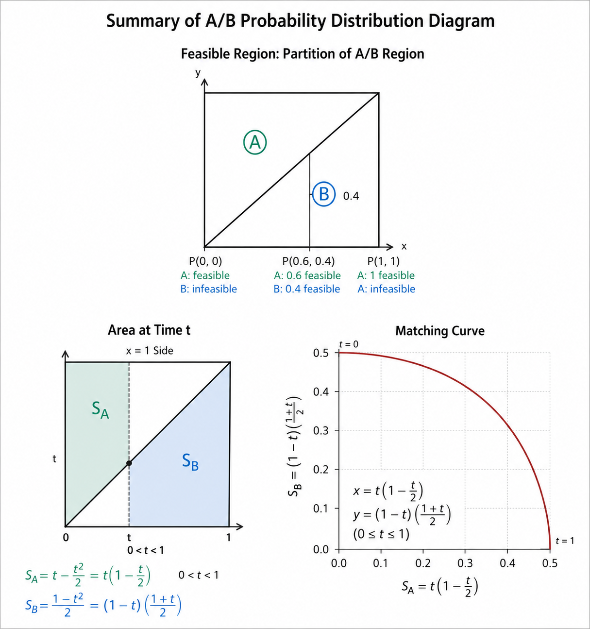
The diagram can be interpreted as a unit square of resources. Each point in the square represents a small resource unit with a different relative suitability for A and B.
The diagonal divides the square into two regions. The area above the diagonal represents resources relatively better suited for A, while the area below the diagonal represents resources relatively better suited for B.
Now choose .
Resources on the left side of are assigned to A. The A-producing region is the left rectangle minus the triangle below the diagonal.
The rectangle has area , and the triangle below the diagonal has area . Therefore:
Resources on the right side of are assigned to B. The B-producing region is the area below the diagonal from to .
Since the diagonal has height , this area is:
So the production frontier can be written parametrically as:
When , all available production is assigned to B, so and . When , all available production is assigned to A, so and .
Slope and increasing opportunity cost
Differentiate both outputs with respect to :
Therefore the slope of the frontier is:
As increases, this slope becomes more negative. This means that producing more A requires giving up increasingly more B.
That is the mathematical expression of increasing marginal opportunity cost.
Why the curve becomes convex
At first, when A production increases, the economy uses resources that are especially well-suited for A. Since those resources were not very efficient for B anyway, the loss of B is small.
But as A production continues to increase, the economy must start using resources that are less suitable for A and more suitable for B. At that point, each additional unit of A requires giving up more B.
This is why the production possibilities curve becomes convex to the origin. The shape follows naturally from heterogeneous resources and efficient allocation.
Limits of the model
This model is highly idealized.
Real production is not perfectly continuous. Real resources also cannot be fully described by a single productivity ratio between A and B. Some production processes require fixed capital, coordination, or specific combinations of resources.
The assumption that A and B are similar goods is also restrictive. If two goods require completely different production processes, the model becomes much less realistic.
There are also cases where the PPC may not have the standard convex shape. If a good requires large initial capital or strong economies of scale, concentrating resources in one industry may increase average productivity. In that case, the curve can become concave rather than convex.
Still, this thought experiment helps reveal the assumptions hidden behind a textbook curve. The PPC is not just a graph. It is a compressed model of resource heterogeneity, efficient allocation, and increasing opportunity cost.